Overview
The Eranova platform started as a simple tool enabling companies to create “knowledge sources” from their
own files, which AI agents could then use to provide informed answers to questions. When I joined Eranova, the core
functionality was in place, but the interface felt visually inconsistent, hard to navigate, and wasn’t built
to scale.
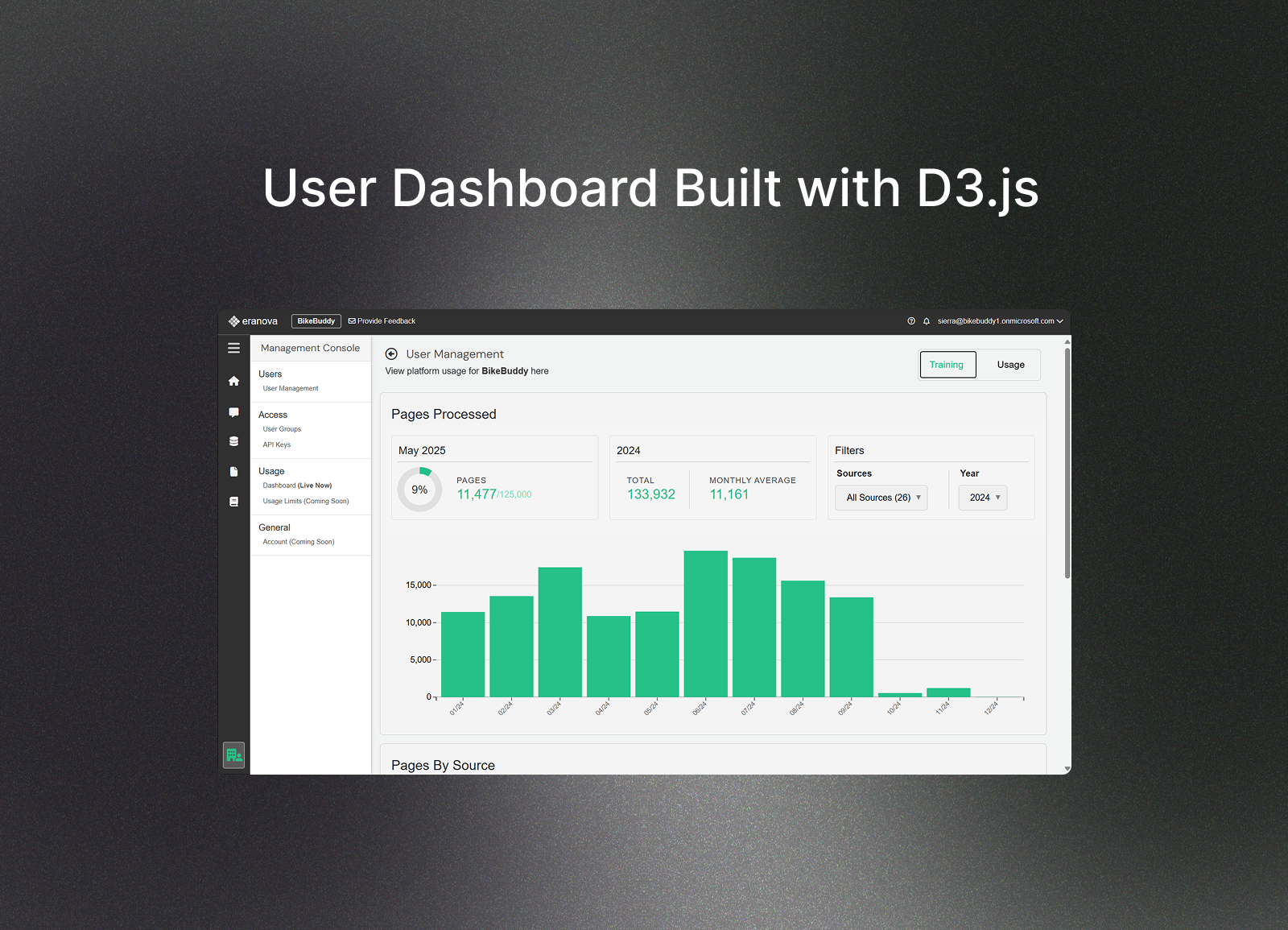
Since joining Eranova, I created a new dashboard for clients to track their usage data and led a comprehensive design and frontend overhaul. This involved rethinking layouts and component hierarchies, creating a modular, intuitive design system, and rebuilding the frontend with reusable, scalable patterns.
Though the platform continues to evolve, my work laid the foundation for its user experience and visual identity, setting a clear standard for the team going forward.

Problem
The platform grew quickly, but design fell behind, resulting in inconsistent UI, hard-to-read data views,
disjointed layouts, and weak feedback on key actions. My goal was to unify the design, improve usability,
and create a cleaner, more intuitive experience.

redesign example
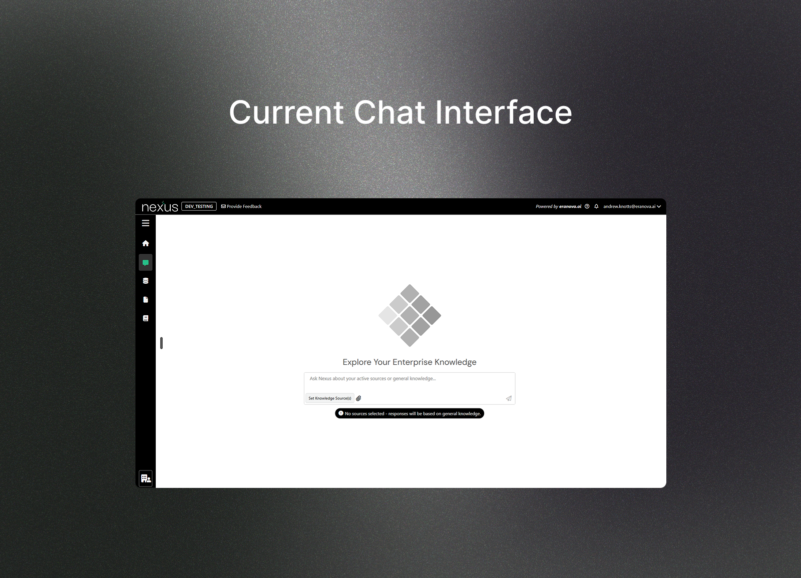
Below is a comparison of the original interface and the new version in development. The redesign showcases the streamlined left nav-bar, improved animations, and refined visual design that combine to create a cleaner, more intuitive user experience.
Before
After